In 2022, the Chicago Warriors hockey team partnered with the Blackhawks to create a distinct identity for the nonprofit disabled veteran hockey club. Previously, the team’s jerseys featured the Blackhawks logo but lacked original branding. The goal was to develop an identity that felt connected to the Blackhawks while also standing apart with its own unique branding.
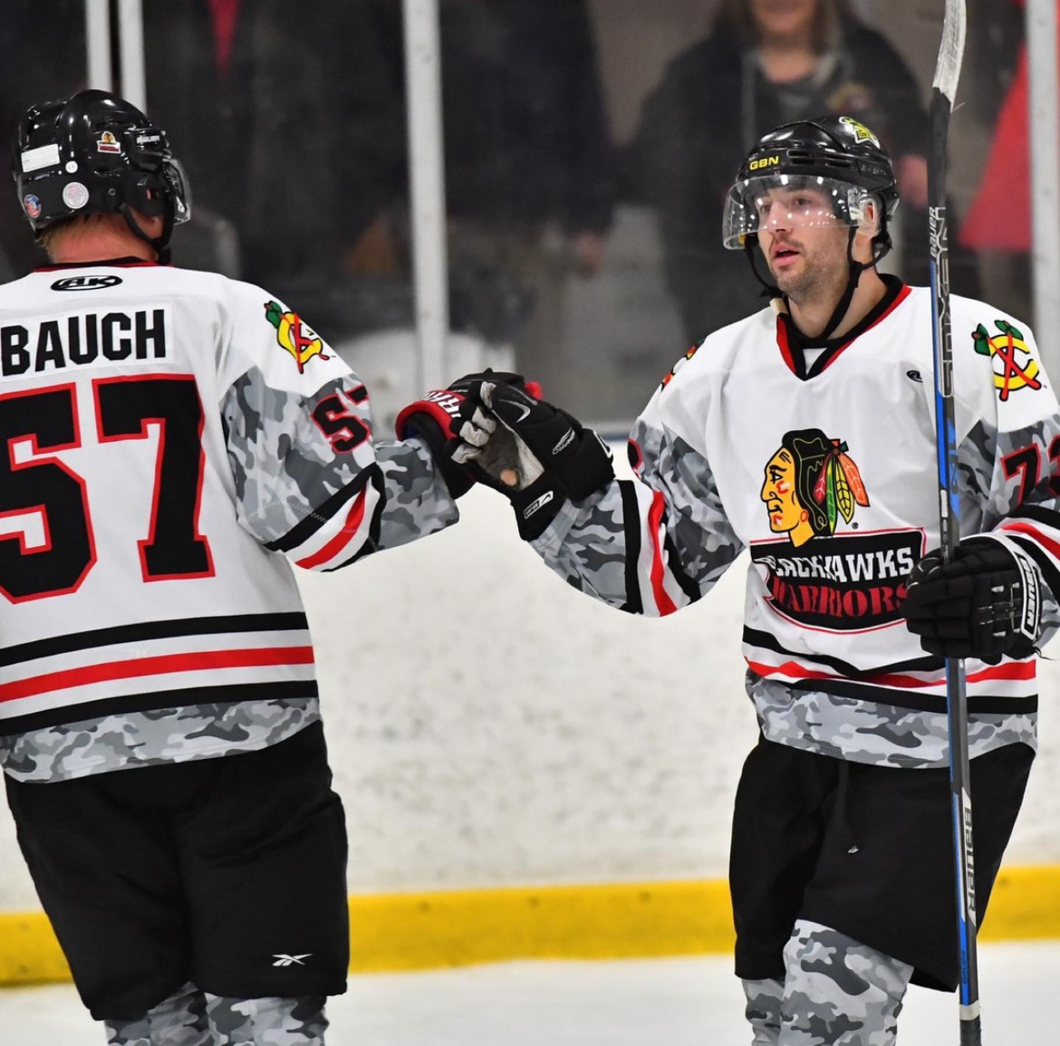
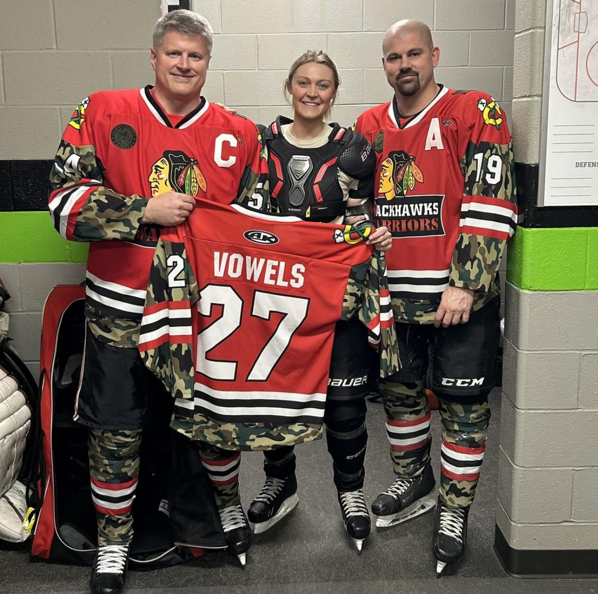
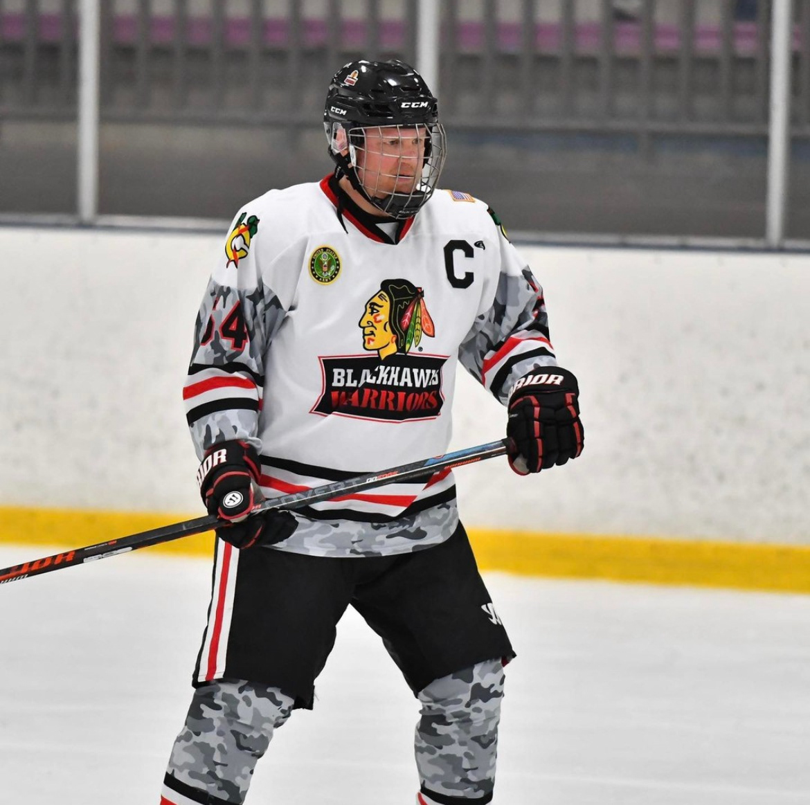
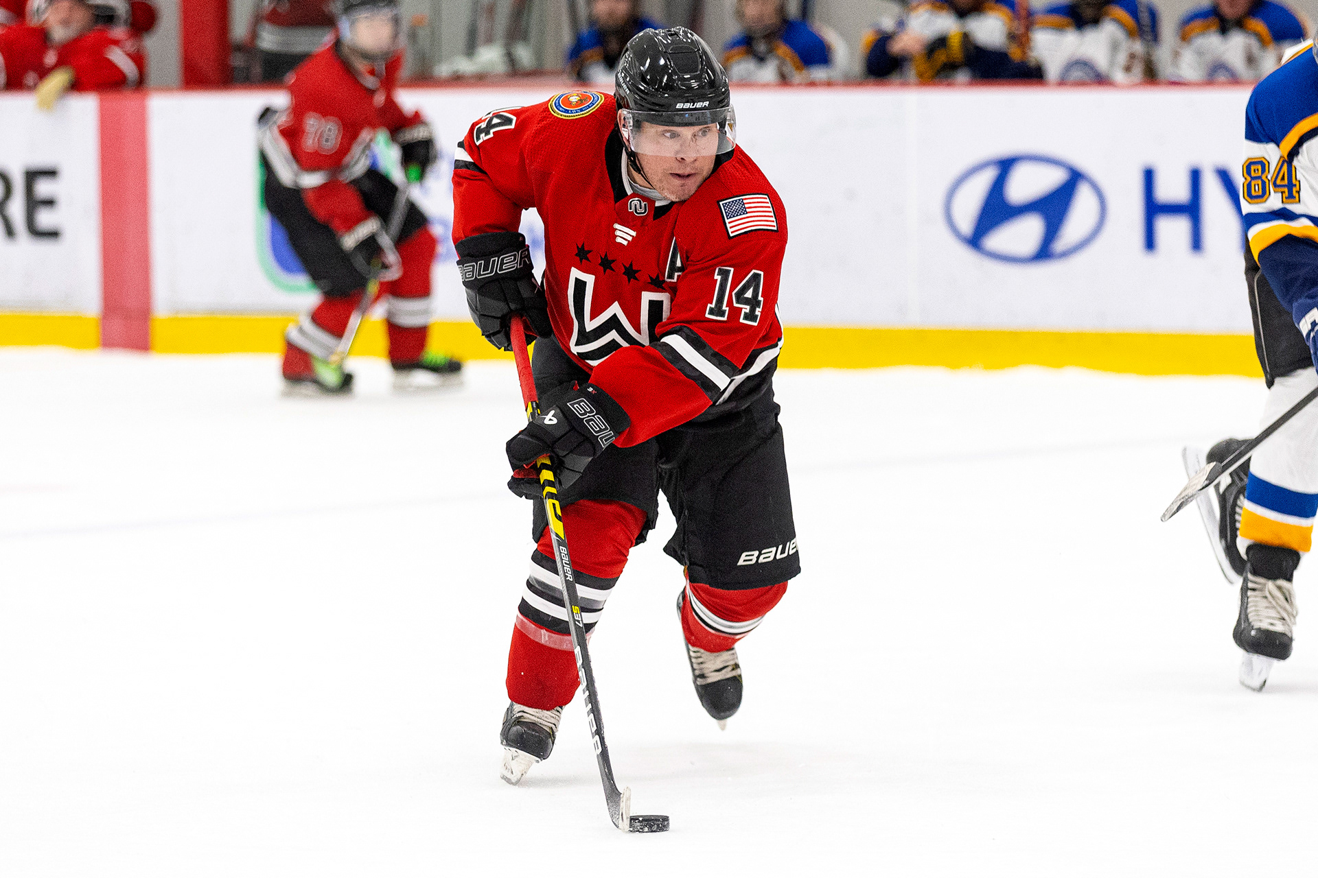
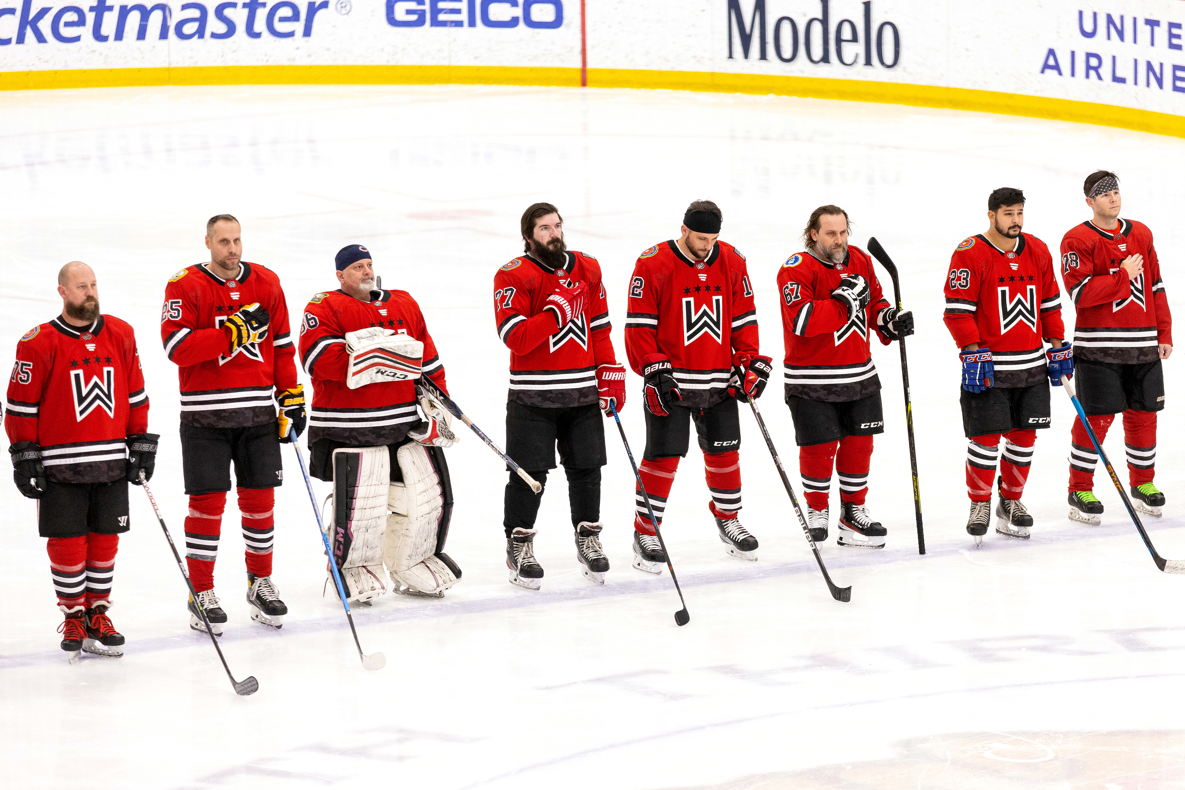
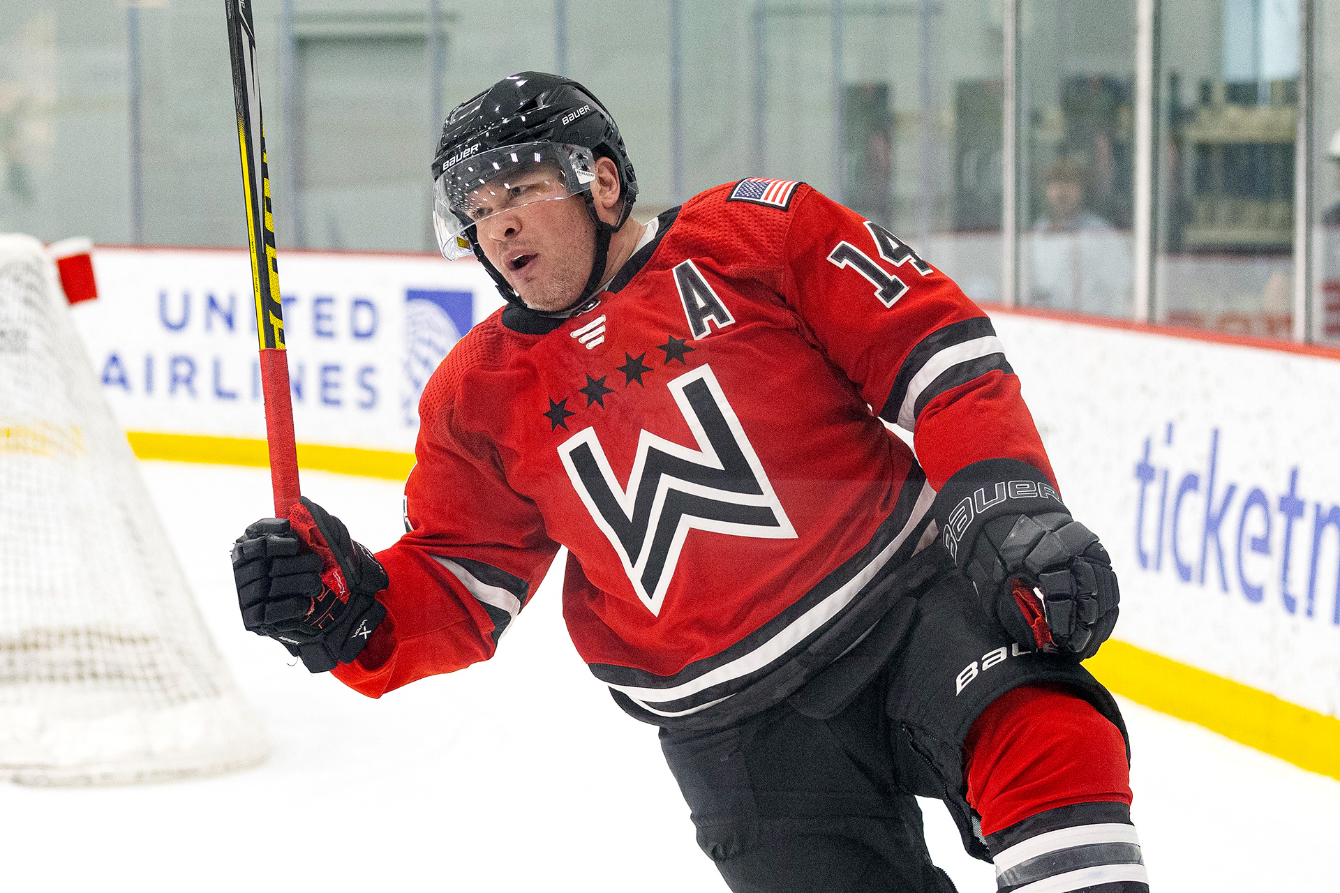
The challenge was designing a logo that represented all branches of the military without relying on clichéd imagery, giving the Warriors a distinct identity. The inspiration came from military rank insignia, which have a similar shape to the letter “W.” I sketched a chevron-style “W” and incorporated four six-pointed stars from the Chicago flag. Together, the elements symbolize “Chicago Warriors,” with the stars representing the city and the W standing for Warriors.
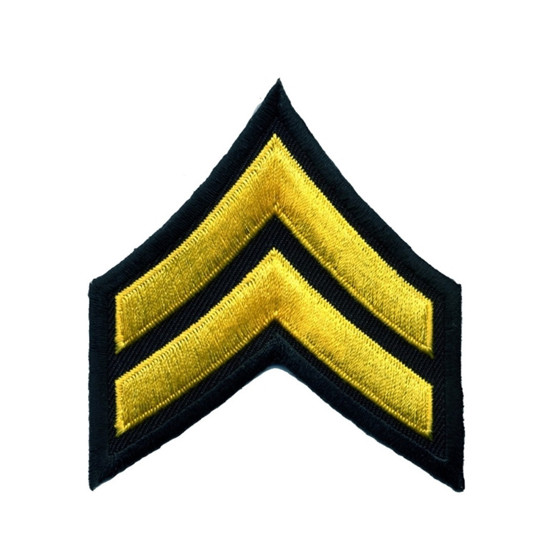


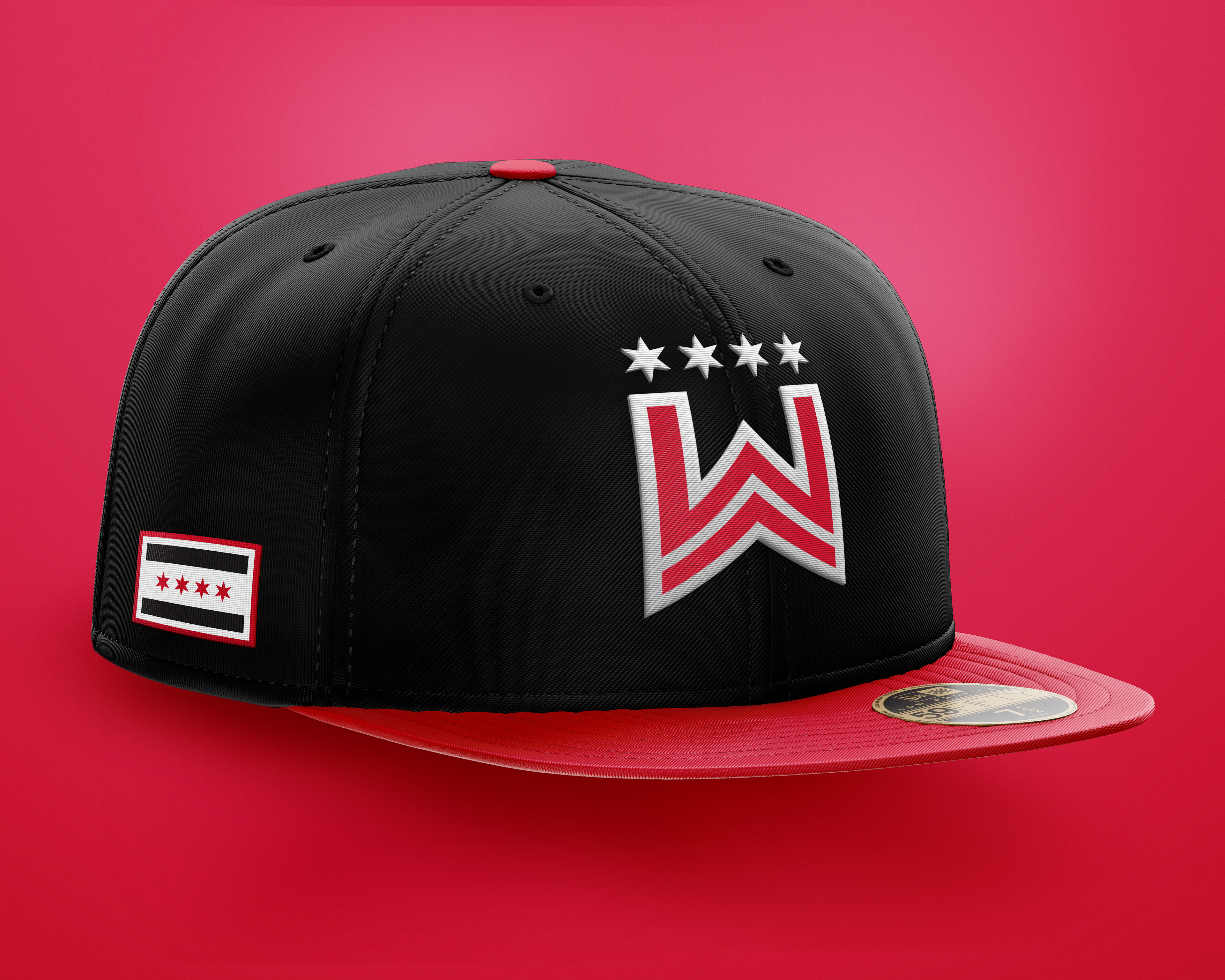
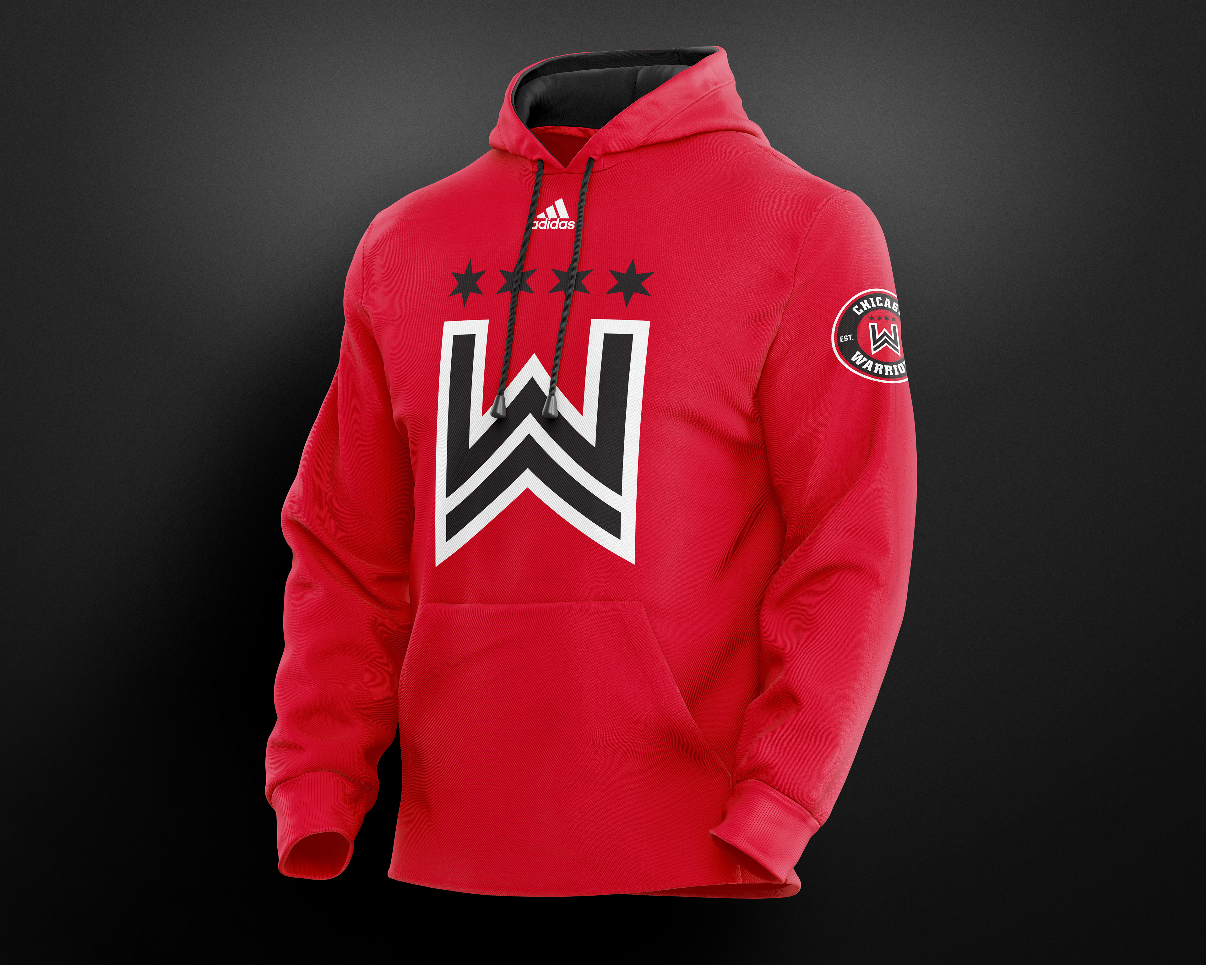
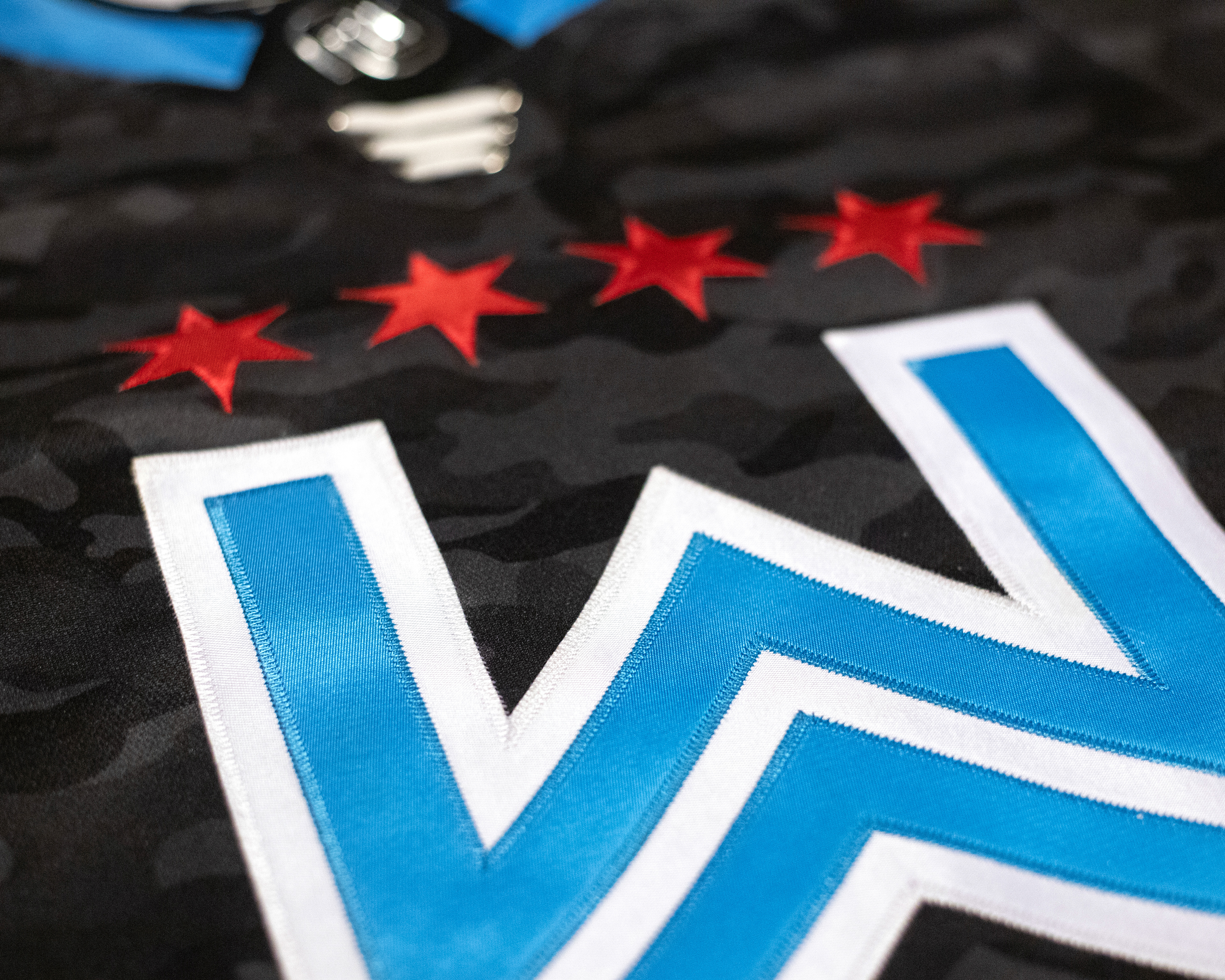
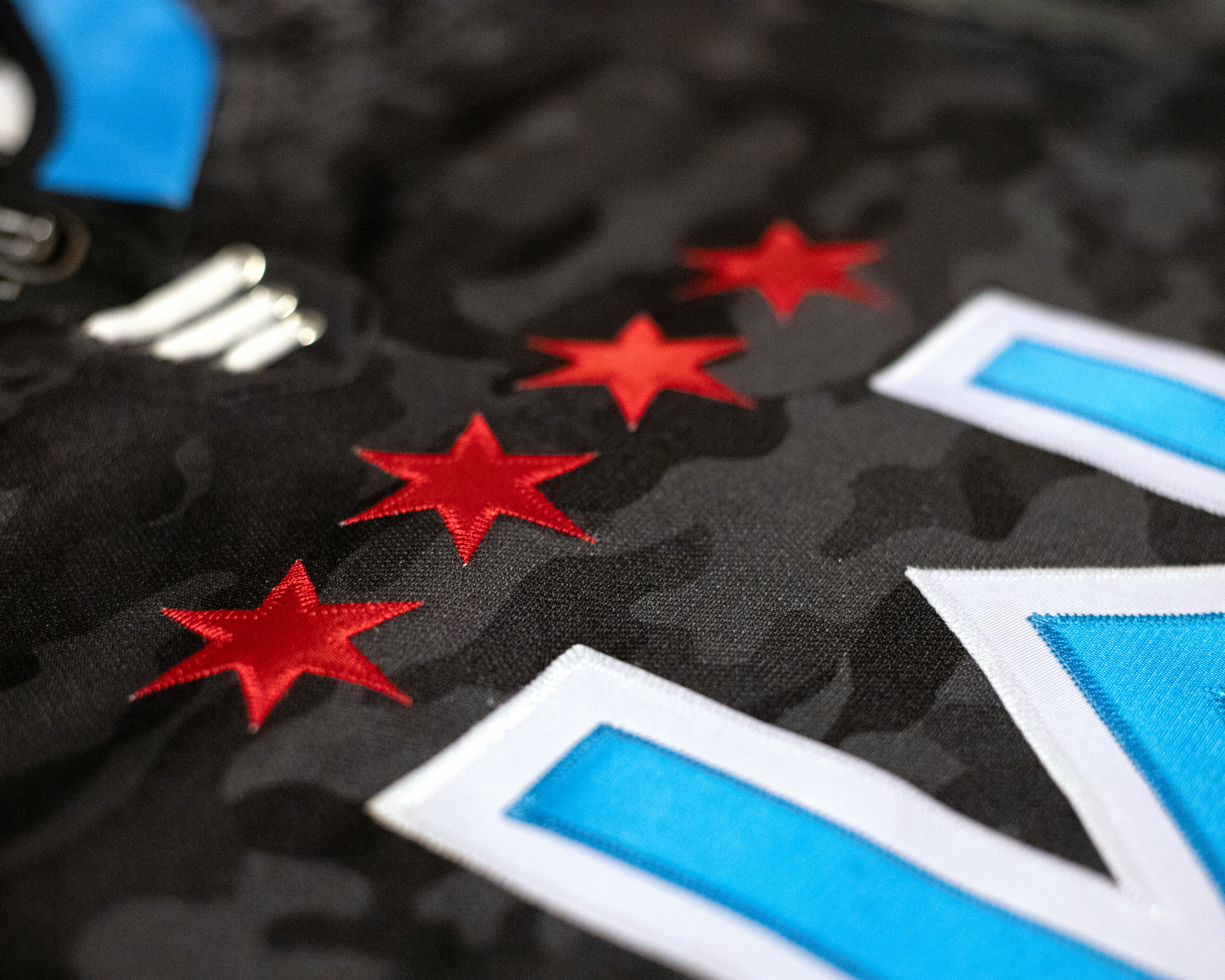
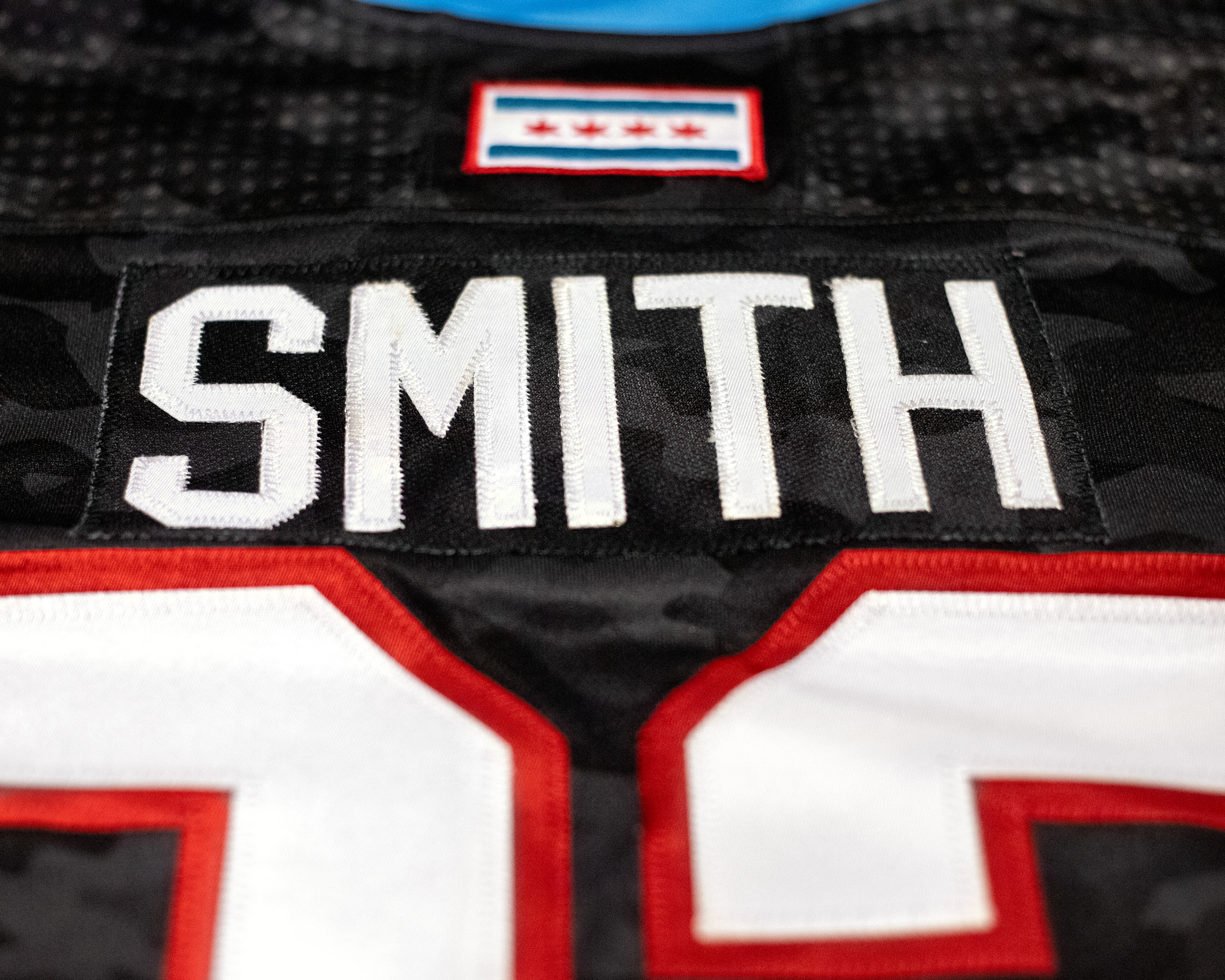
The uniform designs were influenced by military dress and combat uniforms, camouflage patterns, and the Chicago flag. While keeping ties to the Blackhawks’ iconic uniforms, the red and white jerseys introduced a black tonal camo pattern and inverted striping, while a third jersey in Chicago flag colors features an all-black camo base. American flag, military service, and Chicago flag patches complete the uniforms, seamlessly blending military pride with Blackhawks heritage.
responsible for: logo and uniform design
CREDITS:
Creative Director: Michael Benford
Creative Manager: Lindsay Wright
Senior Graphic Designer: Jordan Smith
Manager, Photography: Chase Agnello-Dean
Photography Assistant: Adam Eberhardt
Social Impact Team: Sara Guderyahn, Annie Davis-Korelc, Sarah Triner
All artwork, photography, and video content featured in this portfolio are the property of the Chicago Blackhawks and Chicago Warriors. These materials are presented solely to demonstrate my design and creative contributions and are not owned by me.
